Brisa
August '25
A passion project I developed during summer break, which started with researching packaging design for inspiration and looking into mockup creation. Firstly, I brainstormed and sketched different ideas for a brand name and general idea of an identity; logo, colour palette, product names, mockups etc.
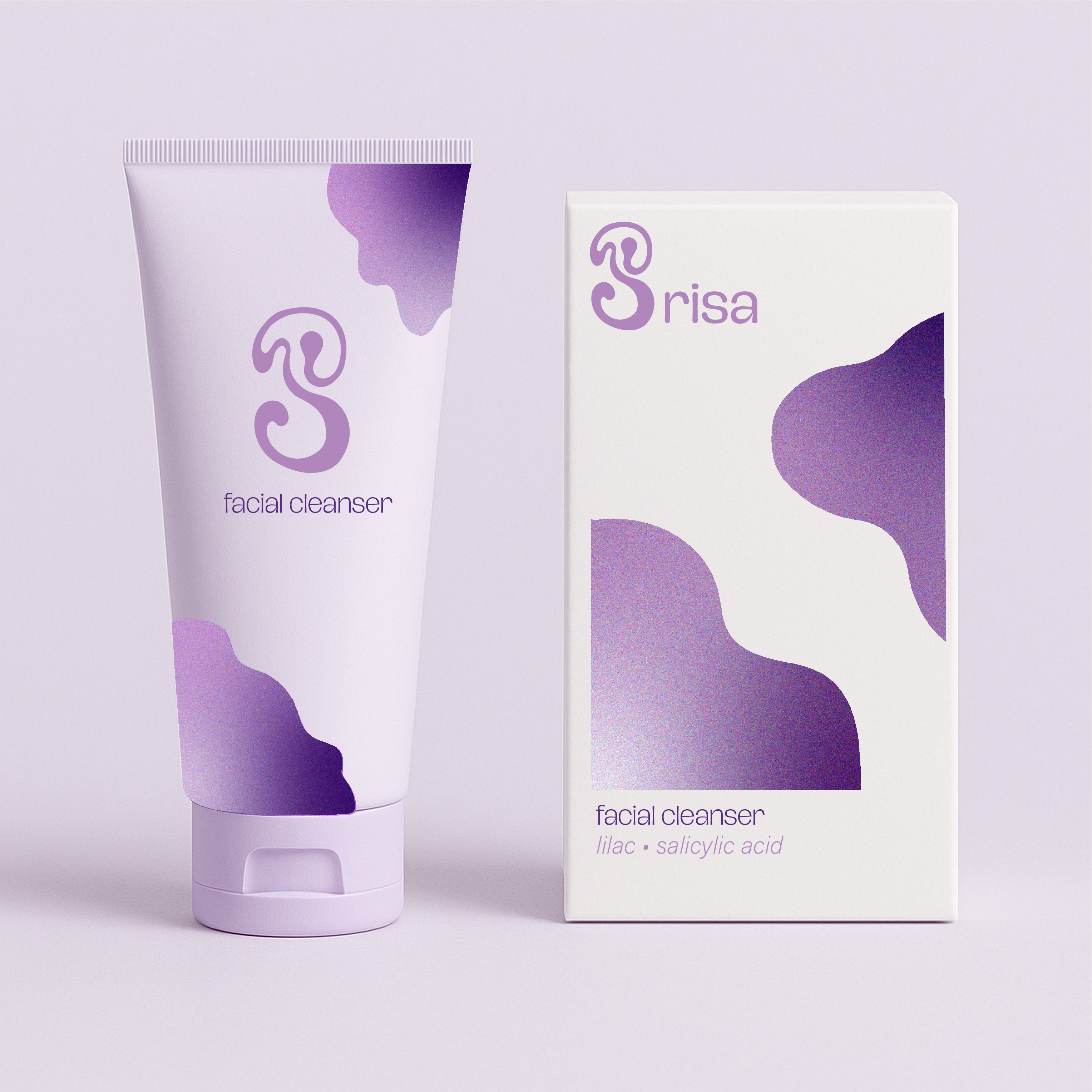
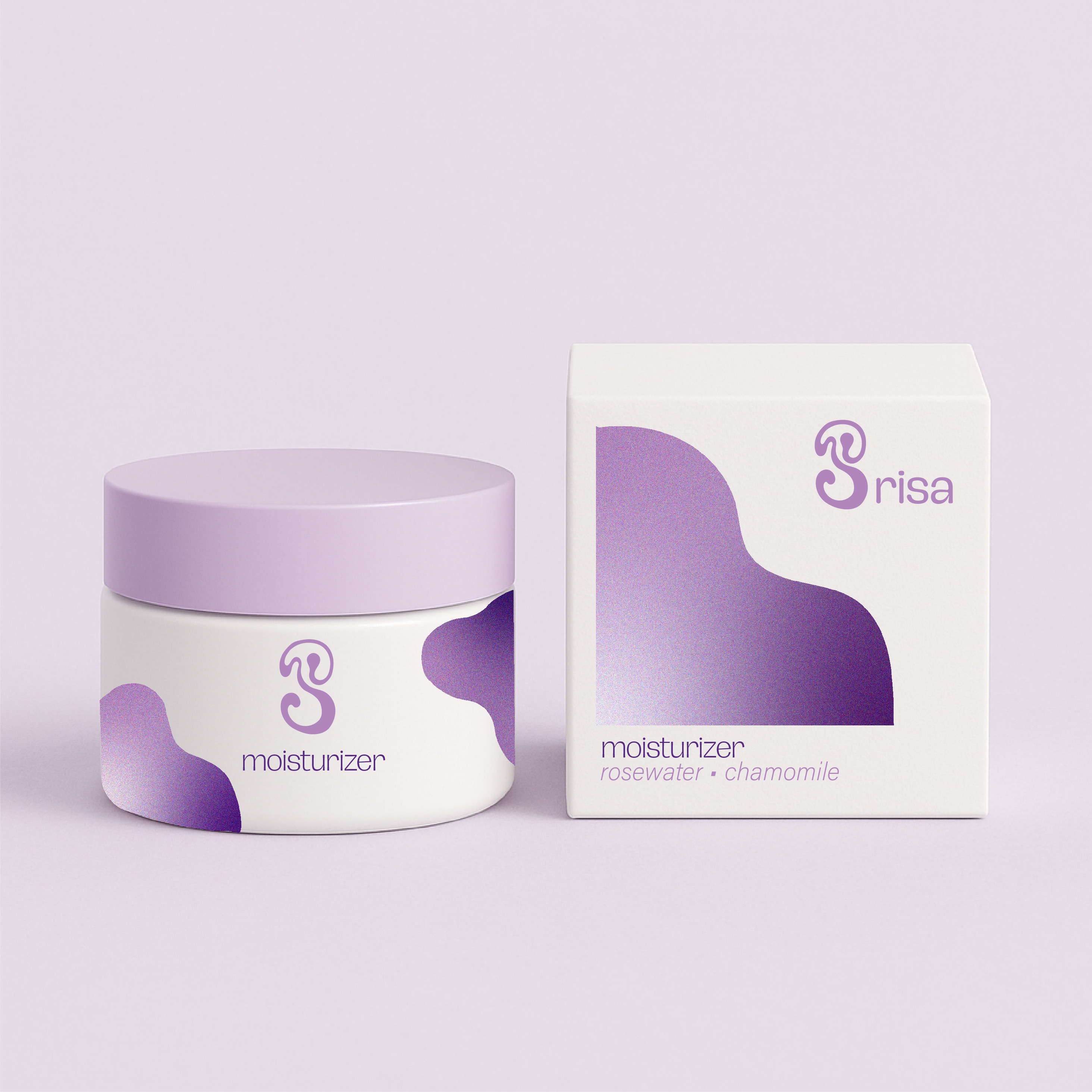
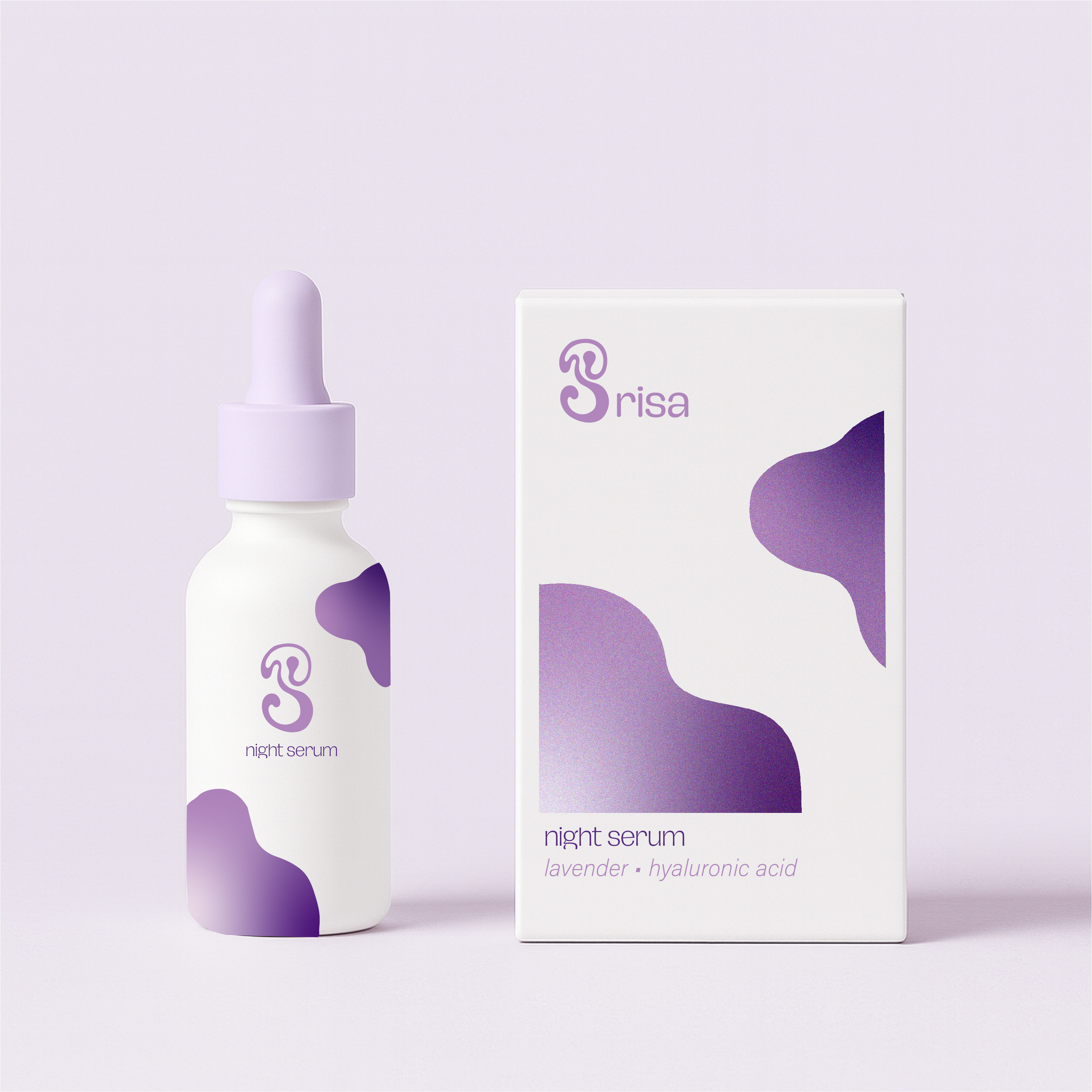
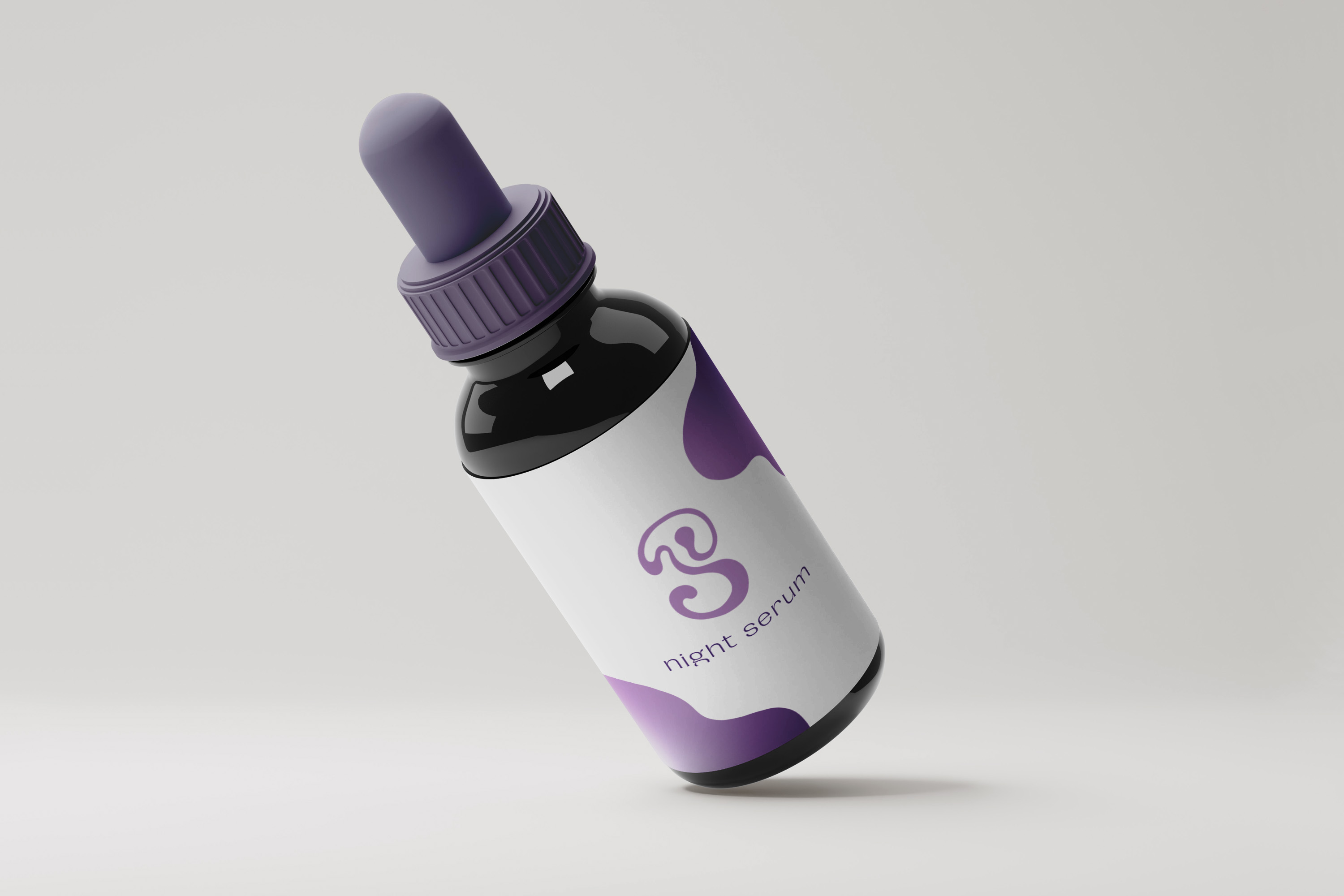
Through many tryouts, I came up with “Brisa”, breeze in Spanish and Portuguese, a skincare brand with light and refreshing products. Inspired by lavender and lilac flowers, the colour palette aims for a serene, elegant and soothing identity. The hand-drawn B logo suggests elegance, but in a playful and organic way through the curved flowing lines, aligning with the wellness and soothing products. The abstract gradient shapes visualise the name ‘Brisa’(breeze) mimicking the transitions between light and air.
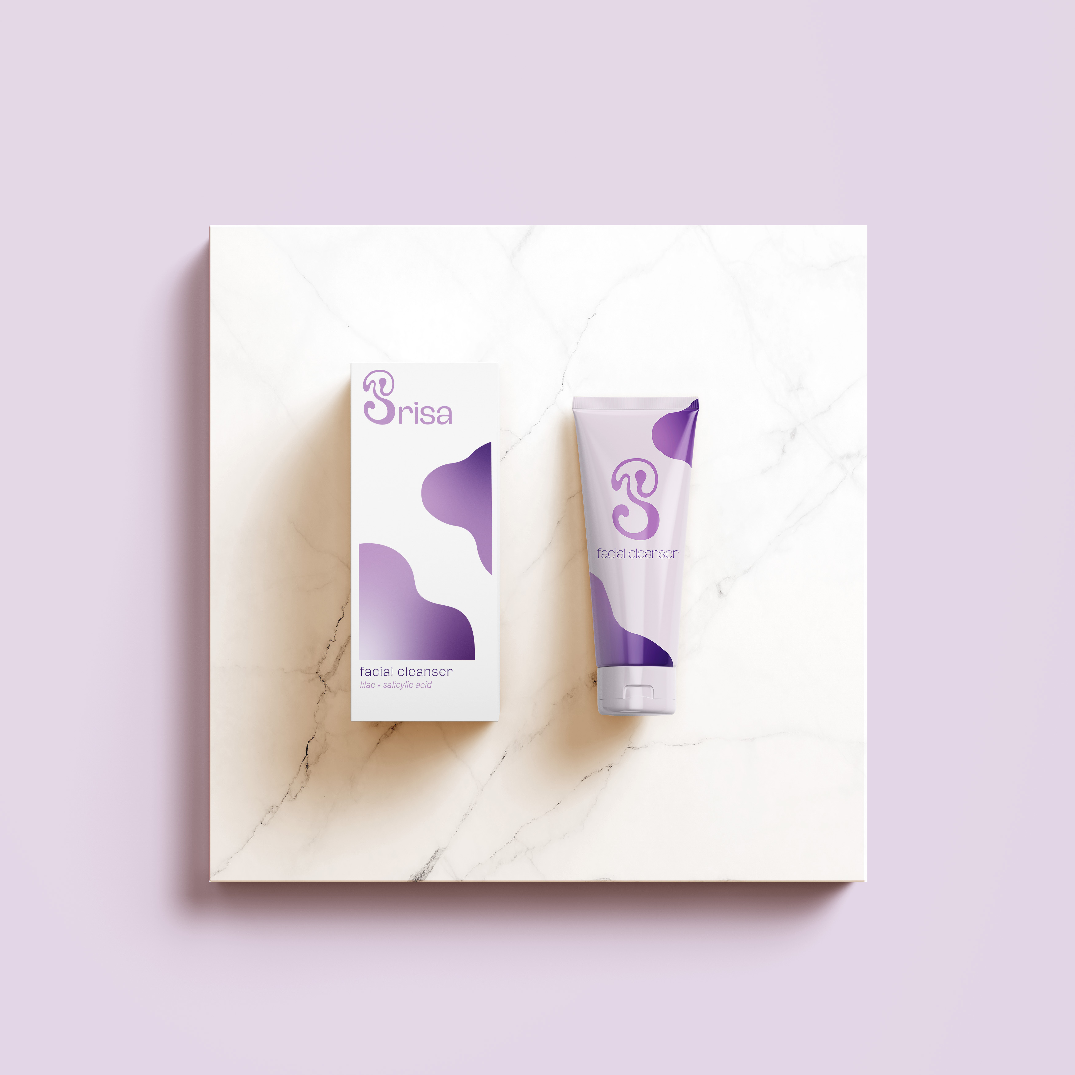
After experimenting with different product ideas, I decided on a simple 3-product identity: a facial serum with salicylic acid and lilac, a moisturising cream with rosewater and chamomile and a night serum with lavender and hyaluronic acid. Lastly, I put everything together in illustrator and created some mockups using stock images and some downloadable mockups in order to bring my designs to life.
